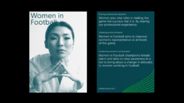
SBI Barcelona was born ten years ago aiming to reinvent the sports business and football management educational landscape. Even though they managed to be one of the most relevant schools in this field, ten years after launching the brand they felt the need to review and update their look.
We establish the main values of the brand and work from there under the slogan "The Perfect Match", a concept that allows us to thread the whole brand founded on the idea that business and football can walk together while maintaining their essence.
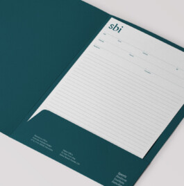
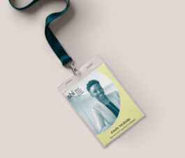
SBI branding project is inspired by the perfect match between the joy and self-demanding of playing sports and the passion and strength of the business world. The brand is based on enthusiasm, confidence, and straight-talking as its main values, as shown through an art direction that is always looking for balance beside both worlds, sports and business, and caring about details that transmit these values.
This tension between both worlds makes the brand look sporty & dynamic, while it is also sophisticated and smart.
“After 10 years we decided to rebrand the visual identity of the company. From day one Irene understood and captured the essence of SBI, the process of defining the logo, brand colors and design elements went amazingly smooth as the material Irene developed in between our meetings always matched what we were looking for.
With her help, the company's visual identity now goes exactly in line with our business.”
Diego Valdés , CEO & Founder
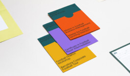
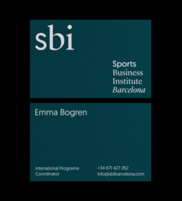
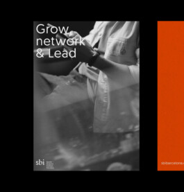
The business environment is represented through an elegant serif font, sober colors, organic lines, and sophisticated style photos. On the other hand, sports appear as an energetic sans serif font, pop color palette, and squared shapes that reminds us of the shape of football fields.
All surrounded by the joy of sharing moments with colleagues and the power of the community and networking.
Scope: Creative & Art Direction, Branding, UI Design

SBI Barcelona was born ten years ago aiming to reinvent the sports business and football management educational landscape. Even though they managed to be one of the most relevant schools in this field, ten years after launching the brand they felt the need to review and update their look.
We establish the main values of the brand and work from there under the slogan "The Perfect Match", a concept that allows us to thread the whole brand founded on the idea that business and football can walk together while maintaining their essence.
SBI branding project is inspired by the perfect match between the joy and self-demanding of playing sports and the passion and strength of the business world. The brand is based on enthusiasm, confidence, and straight-talking as its main values, as shown through an art direction that is always looking for balance beside both worlds, sports and business, and caring about details that transmit these values.
This tension between both worlds makes the brand look sporty & dynamic, while it is also sophisticated and smart.


“After 10 years we decided to rebrand the visual identity of the company. From day one Irene understood and captured the essence of SBI, the process of defining the logo, brand colors and design elements went amazingly smooth as the material Irene developed in between our meetings always matched what we were looking for.
With her help, the company's visual identity now goes exactly in line with our business.”
Diego Valdés , CEO & Founder

The business environment is represented through an elegant serif font, sober colors, organic lines, and sophisticated style photos. On the other hand, sports appear as an energetic sans serif font, pop color palette, and squared shapes that reminds us of the shape of football fields.
All surrounded by the joy of sharing moments with colleagues and the power of the community and networking.


Scope: Creative & Art Direction, Branding, UI Design
Privacy Policy @2024 Irene Sierra